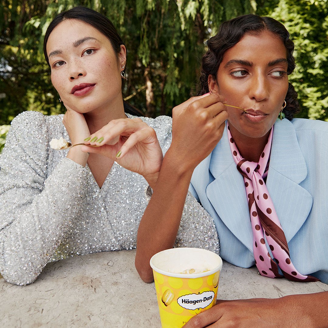
Häagen-Dazs felt dated and old. We wanted to take a new approach and with our campaign slogan Don't hold back, we had the opportunity to push the brand into the future. These are images taken by Patricia Reyes and Art direction by me.
Art Direction
The goal was to break away from the traditional, classic perception of Häagen-Dazs and infuse the brand with a modern, bold, and confident energy. Every visual element was carefully crafted to reflect this evolution: vibrant colors, dynamic compositions, and expressive styling work together to evoke a sense of indulgence without restraint. The imagery captures moments of unapologetic enjoyment, inviting consumers to embrace their desires fully.
Collaborating closely with Patricia Reyes, we focused on creating authentic, impactful shots that feel fresh and engaging while maintaining the premium essence of Häagen-Dazs. The campaign’s visuals are designed to resonate across multiple platforms, delivering a cohesive message that encourages people to savor life’s pleasures without hesitation.
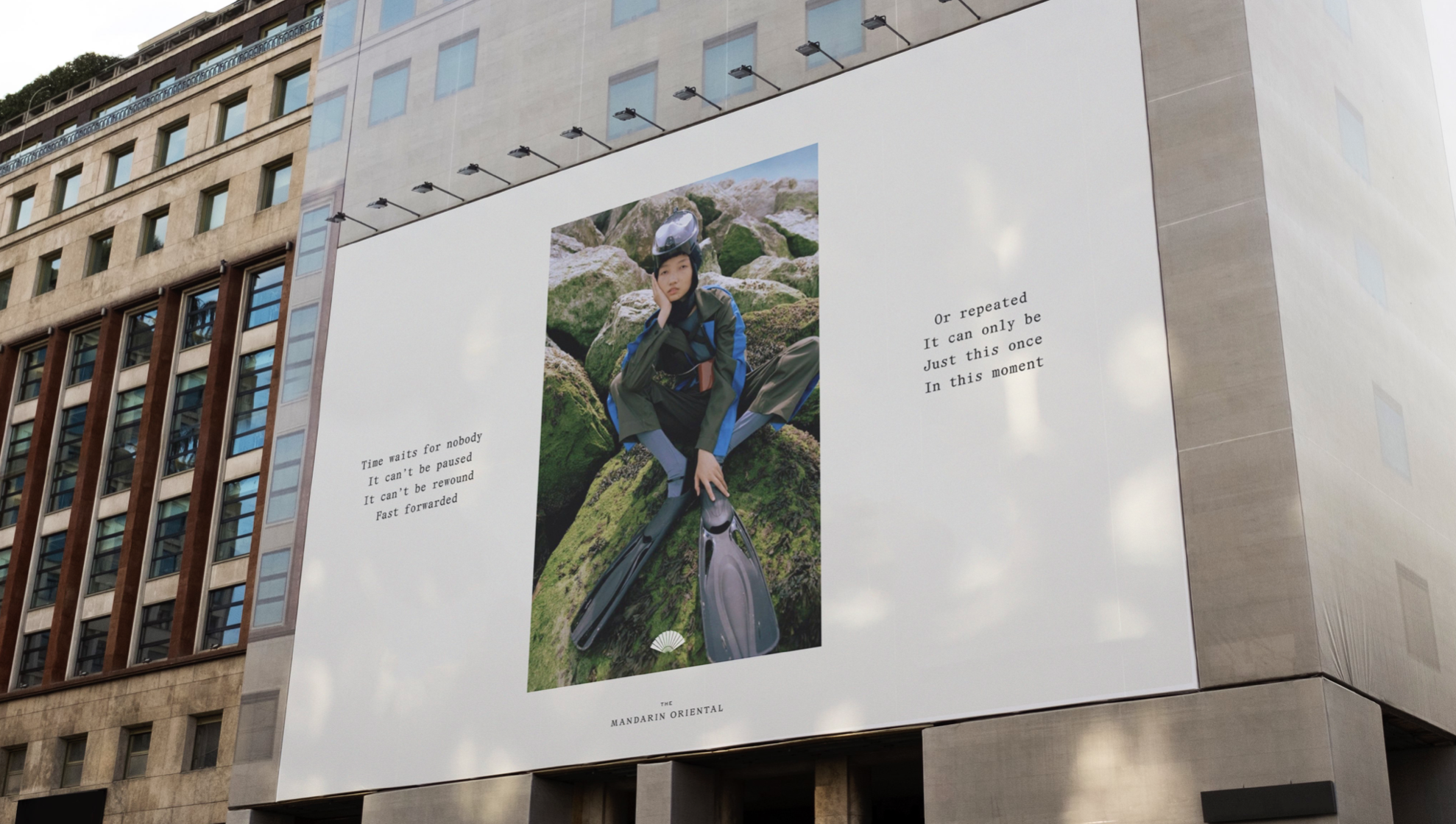
We were a large and dedicated team behind this pitch to win Mandarin Oriental globally, each member bringing unique strengths to the table. My contribution lay in my strong visual aesthetics and my ability to seamlessly blend fashion with emotion. This approach allowed me to create designs that are not only premium and sophisticated but also compelling and eye-catching, ensuring the final presentation was both interesting and head-turning.
Art Direction & design
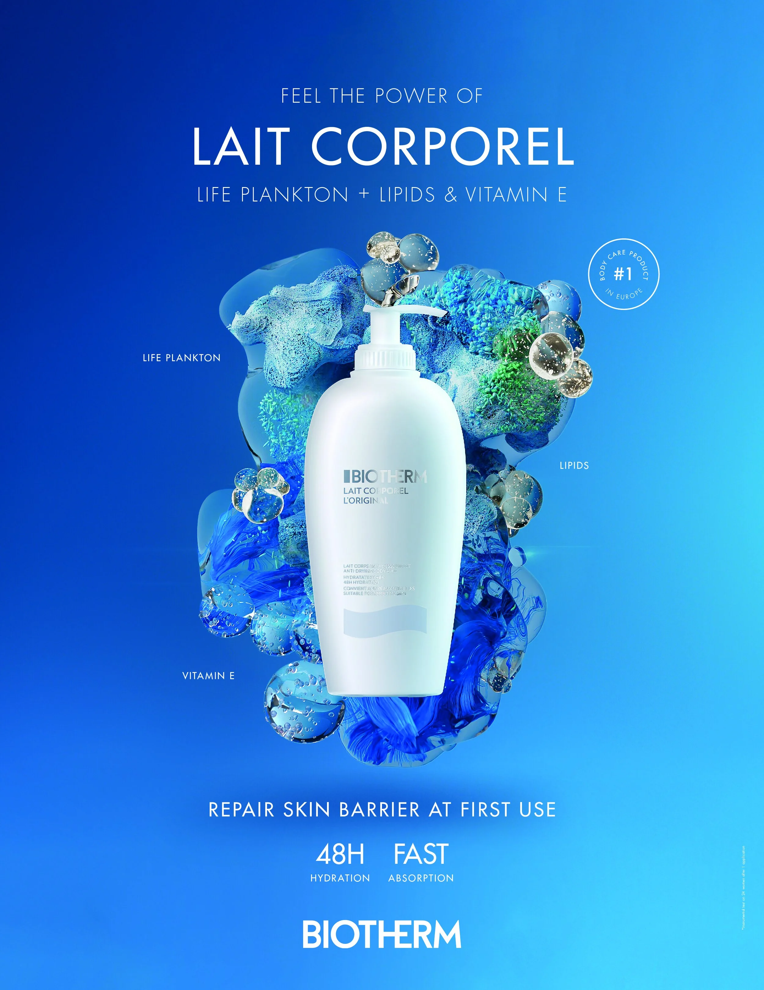
We wanted to push Biotherm beyond their comfort zone, challenging them to take a bold stand that resonated with a younger audience. Their existing messaging felt safe and familiar, but to successfully introduce their new body lotion to millennials and Gen Z consumers, they needed a fresh, daring approach. The goal was to create a campaign that not only spoke directly to younger skin care enthusiasts but also reflected their values and lifestyle, encouraging Biotherm to embrace a more dynamic and youthful identity.
SEB’s commitment to art goes beyond collecting — it’s a celebration of passion, vision, and bold thinking. I was tasked with creating a film that captured this spirit, using the bank’s vast Nordic art collection as both setting and inspiration.
The concept: position SEB as the bank for those who follow their passion — whether artists, entrepreneurs, or innovators. We brought this to life through a poetic film blending dance, music, and spoken word. A dancer guides us through SEB’s collection, with a voiceover narrating a tribute to creative drive.
More than a showcase of art — this was about expressing SEB’s identity through art itself.
We had the
We had the opportunity to create a gender-free campaign for Zalando, highlighting several fashion designers who specialize in gender-free clothing. Our approach centered on showcasing the work of individuals and brands committed to breaking traditional gender norms through fashion. To amplify this message, we partnered with strong influencers and voices who embody the principle that gender does not define style or identity. The campaign focuses on inclusivity and self-expression, celebrating those who prioritize authenticity over conventional labels. This project not only promoted innovative fashion but also emphasized the importance of diversity and acceptance in the industry.
Art Direction & design
Plantopia is vegetable milk, crafted by blending two simple ingredients into something uniquely refreshing. Our campaign embraces the idea of "being a blend"—just like Plantopia combines flavors, you can bring together different parts of yourself to create something new and authentic. Whether it’s your passions, interests, or styles, blending it all together makes you who you are. Plantopia celebrates that spirit of combination and individuality in every sip.
Art direction,
The short film about SEB’s introduction into the American stock market blends distinctly American phrasing with the reserved, precise tone characteristic of Swedish banking language. This intentional mix creates a subtle friction that adds an engaging edge to the communication, making it feel both authentic and refreshingly candid. Paired with striking footage of iconic American landmarks, the film unmistakably grounds SEB’s stock ascent within the American financial landscape, delivering a clear and memorable message about the bank’s new market presence.
Art Direction, Film editing, Animation
Art Direction & design
This was the second campaign I worked on for Häagen-Dazs titled "Don't Hold Back." The core message was clear: you shouldn’t hold back on who you are. Instead, you should embrace your unique qualities and cherish the peculiarities that make you different.
In this campaign, we spotlighted people who express their love for ice cream in extraordinary ways. One woman’s passion was so intense that she created a statue entirely out of ice cream, symbolizing her embrace of her true self without restraint. Another woman adored watermelon ice cream so much that she transformed an entire room to reflect this obsession, illustrating how indulging in what you love is an authentic part of who you are.
The phrase "the ice cream of ice creams" emphasizes that Häagen-Dazs is not just any ice cream — it’s the best, the ultimate indulgence. By celebrating individuality and passion, the campaign encourages people to embrace themselves fully, just as these people do.
Art Direction & design
Package & logo design
Art Direction & film editing
Art Directi
One big part of my job at the moment is to update and transform SEB's visual world into something that feels modern and carries a warmer disposition. This process requires continuous attention and thoughtful adjustments. My role as an Art Director encompasses every stage, from the initial conceptual ideation to the creation of the finished image. By carefully balancing contemporary design trends with a welcoming aesthetic, I aim to reflect SEB’s evolving identity while maintaining clarity and professionalism throughout all visual communications.
on for the SEB youth section